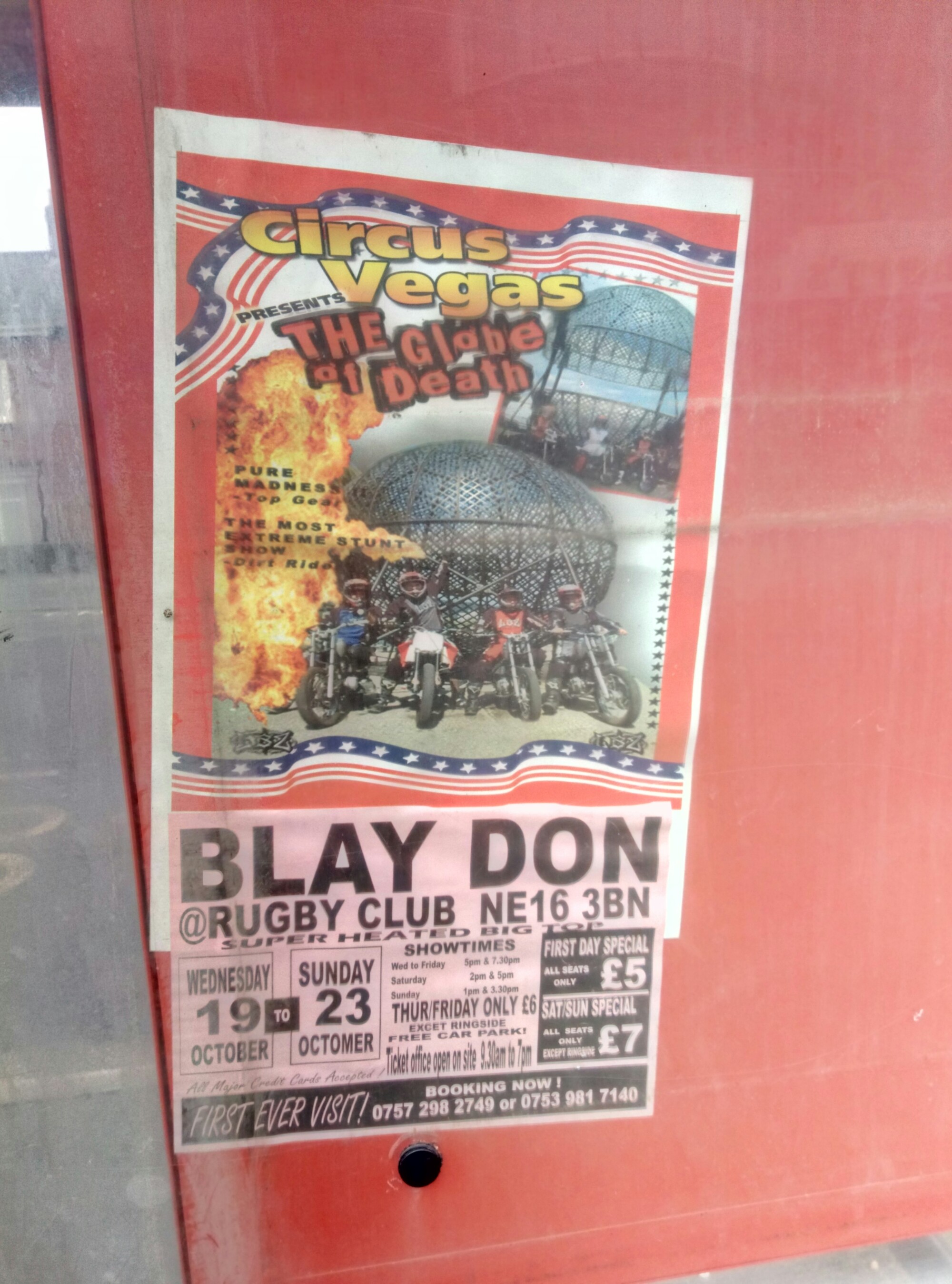
There’s a poster, at my local bus stop, which has been irritating me for some time now. It’s lodged down the back of the timetable and, I’m assuming, can’t easily be removed.
I could be critical of the name Circus Vegas, or, the globe of death (which is clearly a slight exaggeration), but what really irritates me is the BLAY DON kerning issue.
My theory is that, rather than being a typographic error, this is something of a lack of local knowledge.
As an aside, does anyone else recall the alleged wysiwyg software packages of the late 80s/early 90s which couldn’t handle kerning properly?
