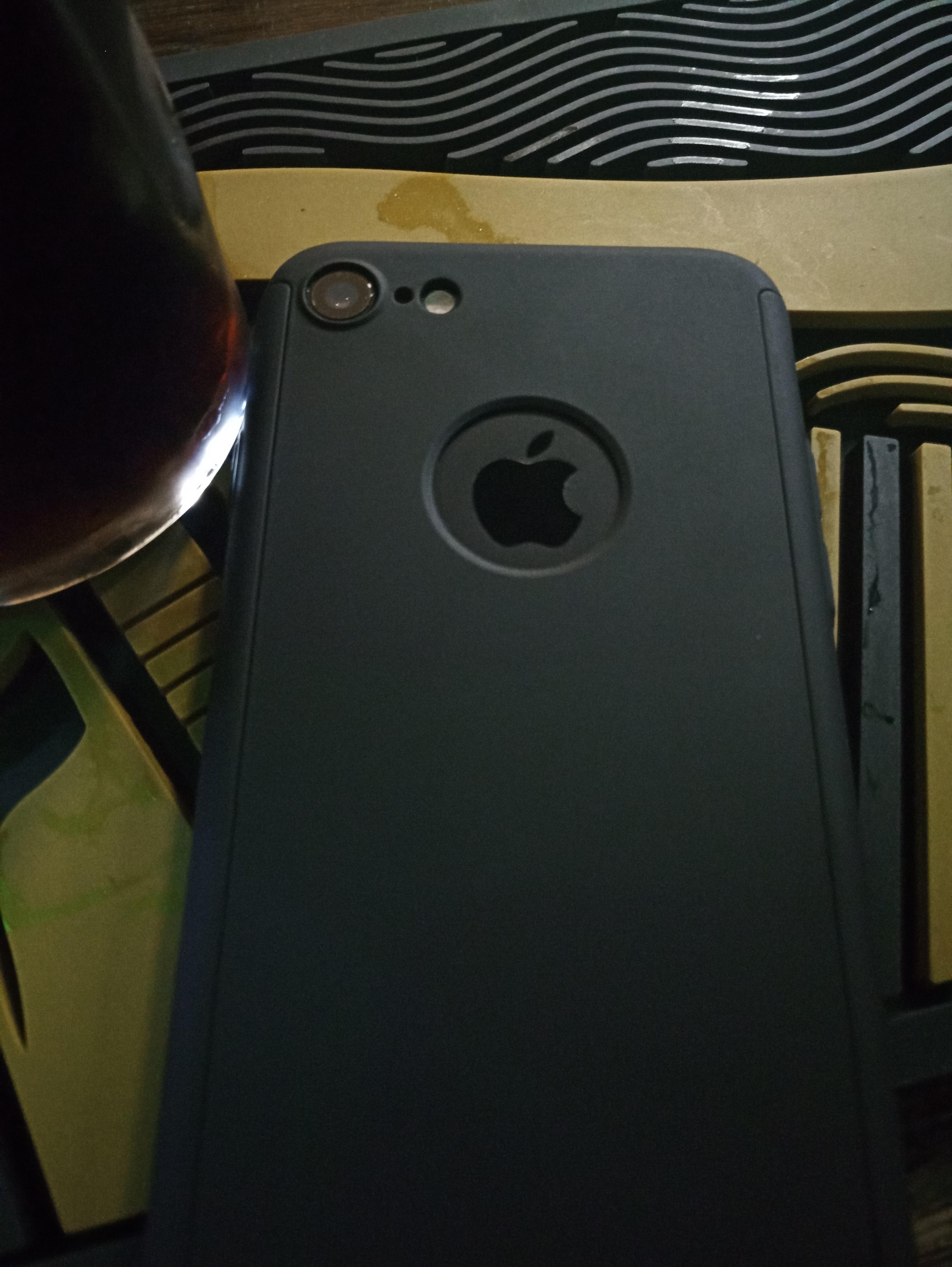
My new work phone is an iPhone. Previously, I had a Blackberry. Said Blackberry was pretty shit, but it sort of worked. For work. The battery life was amazing, even after a few years. It was ugly, but bounced well in the pub.
Anyway, this is my new work phone.

It’s dark; yes. I’m in a pub. That’s OK because the phone is in a protective case (bought personally from eBay for two quid).
Note the Apple logo though. I’ve owned Apple phones in the past and the logo was, in my experience, distinctive but unobtrusive.
Unobtrusive as in seamless to the touch. Let’s focus on on that now.
Unfortunately, I find my my work phone irritating. Because the logo on its back has a definite ridge on one side.
I have an obvious theory (hypothesis, I guess, since this hasn’t been tested in a controlled environment), that HM Government is providing users with commercially rejected products. Hence the logo sharpness on my work phone.
This all reinforces my personal phone preference for Android.
While representing good value for the taxpayer.